

tl;dr: While less common nowadays, it’s still possible that you might need to create a chart that will be printed in black and white. For charts that were originally designed in color, just printing the color chart on a black and white device will often make it uninterpretable, so it must be redesigned. Redesigning a chart so that it only uses black and white can be tricky, though, and different design changes are needed depending on the chart type, number of data series shown, and a variety of other factors.
You’re putting the finishing touches on a chart for your manager when they mention to you that, oh, by the way, the chart will be printed, photocopied or *gasp* faxed on a black and white device before being shown to the target audience. So, can you, y’know, only use black and white in the chart? Not grayscale (which I’ll mention a little later), but truly just black and white, so that it would survive being faxed, or photocopied on your office’s crappy photocopier?
Uh-oh.
If you’re lucky, your chart only uses a single color, in which case redesigning it to only use black and white usually won’t require significant design changes (though the final result will be less visually appealing):

If you’re a little less lucky and your chart uses two colors, you might be able to just change those two colors to black and white:

If, like many charts, your chart uses several colors, just changing them all to black or white will probably make the chart uninterpretable, so a more significant redesign would be required:
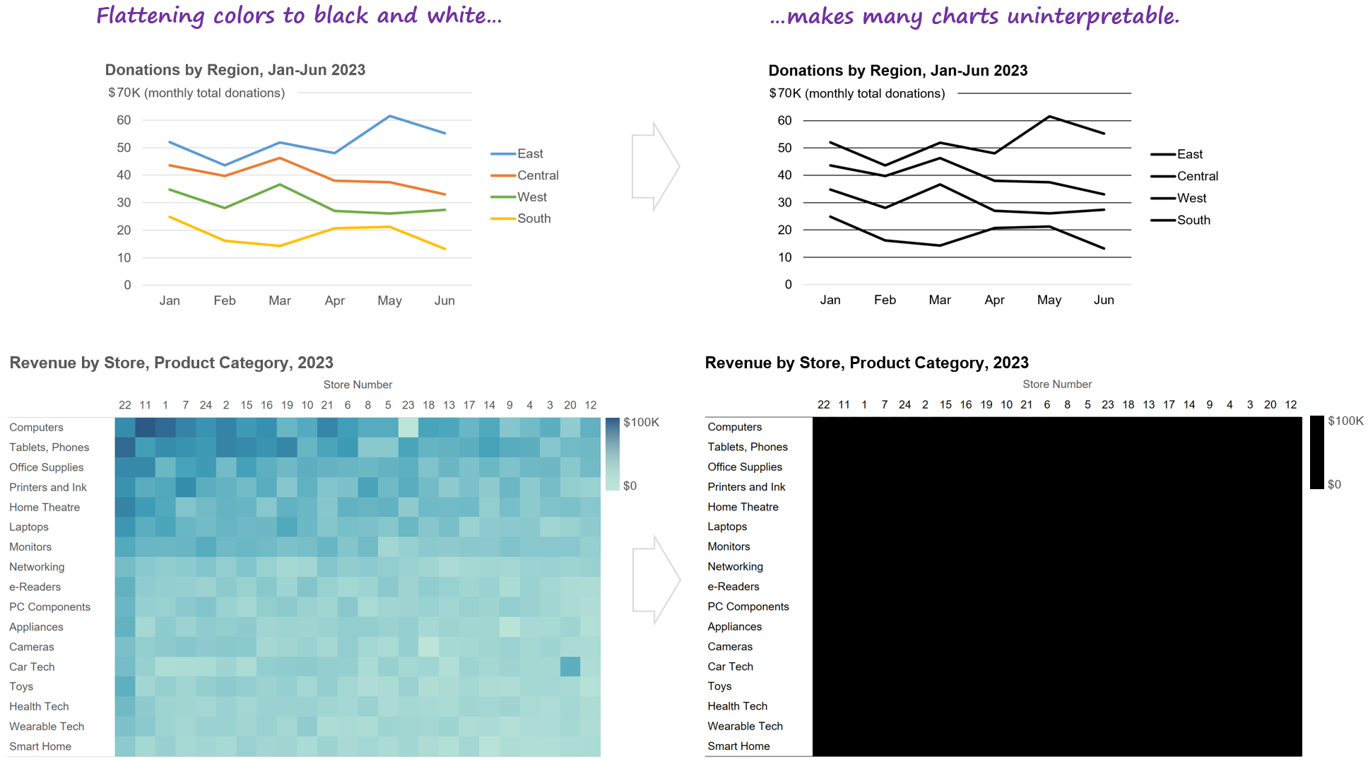
Unfortunately, there’s no single magic-bullet design change that will make all charts work in black and white. Depending on the chart type and a variety of other factors, different design changes will be needed. I’ve listed some common ones below, but all of them come with significant downsides:
Applying any of the design changes below will almost certainly make your chart some combination of visually busier, less appealing, less intuitive, and more effortful to read compared with the original color version. Sorry. There are good reasons why most charts use color…
In some cases, redesigning a chart in black and white might unavoidably increase the risk that the audience will misinterpret the chart.
Some of the design changes below require features that your particular dataviz software may or may not support. If your software won’t cooperate for a given design change, you’ll need to try some of the other design changes.
Because there’s no single magic-bullet solution, you’ll probably need to try several different solutions—or maybe even a combination of solutions—and then choose the “least bad” option. There’s definitely some creativity and trial-and-error involved here.
Consider labeling chart elements directly instead of using a legend.
If you’re lucky, you can just label elements in your chart directly rather than using a legend (which is generally a good thing to do in color charts, as well, btw), and that will be enough for the chart to work in black and white:

Unfortunately, though, there are plenty of situations in which direct labeling won’t work. For example…

A common-but-not-ideal solution in these situations is use different line styles to identify different lines in a black-and-white line chart:

This isn’t a great solution because a) it looks very visually busy, and b) readers tend to perceive dotted and dashed lines as representing data of lower certainty (estimates, projections, targets, etc.), which isn’t the case in the chart above, in which the values are all known, historical values. Is there a better way? Yes…
Consider using different symbol markers.

Yes, this is visually busier than the original color version, but a little less so than the “varied line styles” version, and at least the values look like “known” values rather than estimates or projections.
Another common solution when direct labeling isn’t practical is to use “pattern fills,” a.k.a. “hatch patterns”:

Using pattern fills can cause several potentially significant problems, though:
Many people find dense, repeating patterns uncomfortable to look at, and a 2017 study suggested that they could trigger migraines or even epileptic seizures among some readers.
Fax machines or poor-quality printers might not reproduce the fill patterns properly.
In the same way that striped clothing can make people look taller or wider, pattern fills can cause optical illusions in charts by, for example, making shapes in a chart look longer or shorter than they really are, or making straight shapes looked curved.
Pattern fills may not be discernable in small shapes, such as short bars or thin pie chart slices.
A safer approach is to…
Consider re-arranging the chart into “small multiples.”

More visually busy than the color version? Yup. Harder to compare payment methods for a single region? You betcha. Like I said, most charts use color for a reason…
For “heatmap” charts that use darker and lighter shades of the same color to represent higher and lower values, you could…
Consider using “shape size” (a.k.a. “proportional symbol”) charts.

Visually busier than the heatmap versions? Uh-huh. Harder to spot patterns? Indeed. But at least the chart will be interpretable…
There are other types of design changes that you might need to consider when adapting a chart to be shown in black and white; the examples above are really just ideas to get you started. Like I said, creativity and trial-and-error are your friends in these situations.
As you can see, black-and-white versions of charts are virtually always worse than color versions in a variety of ways. This is why I’m surprised when I occasionally meet chart designers who deliberately try to avoid using color in their charts. To me, that’s like trying to avoid using adjectives in your documents. If your target audience can read adjectives, your documents will be a lot clearer and easier to read if you use them.
What about higher-quality black-and-white printers that can simulate shades of gray by “dithering” tiny black dots on the page? If you know that your chart will be printed on a printer like that, having access to different shades of gray can make things considerably easier, but there are still some potential issues to keep in mind:
Shades of gray on a printed page can vary significantly from what you see on your screen, depending on the quality of the printer, the quality of the toner/ink, quirks of the printer driver software, and other factors. Basically, don’t assume that the shades of gray that you see on your screen will be the same as those on a printed page, and do test prints if you can.
The inability to use different “hues” (red, green, blue, etc.) will often require the chart to be redesigned, since those hues can have specific meanings (e.g., red to indicate problem values).
Typically, darker and lighter shades of the same hue (i.e., gray) represent higher or lower quantities, or categories that are earlier or later in a sequence (e.g., different schooling levels). Using shades of gray to represent categories that have no inherent sequence (e.g., regions, departments, etc.) can be confusing, then, since this can make some categories look like they have “more of something than other categories” or “come after other categories,” regardless of whether that’s true.
You’ll probably be limited to four or, at most, five shades of gray, since they get hard to tell apart if there are more than that.
It’s likely, then, that you’ll still need to redesign your chart if it will be printed on a high-quality black-and-white printer that can simulate shades of gray (though perhaps not as drastically as if it will be printed on a low-quality printer or fax that can’t simulate shades of gray).
[Jan. 10, 2024 update:] Astute readers have pointed out that the techniques in this article can be used to adapt charts for audiences who have severe color vision deficiency (a.k.a., severe “colorblindness”), or who require ultra-high-contrast images because of other visual impairments.
Have other suggestions for, or examples of, adapting charts for black and white? Great! Let me know in the comments below, or on LinkedIn or Twitter!
By the way...
If you’re interested in attending my Practical Charts or Practical Dashboards course, here’s a list of my upcoming open-registration workshops.