Featured posts from the
Practical Reporting Blog
New to this blog? The selection of posts below are representative of the types of topics normally covered.
For further reading, see all posts sorted by month.
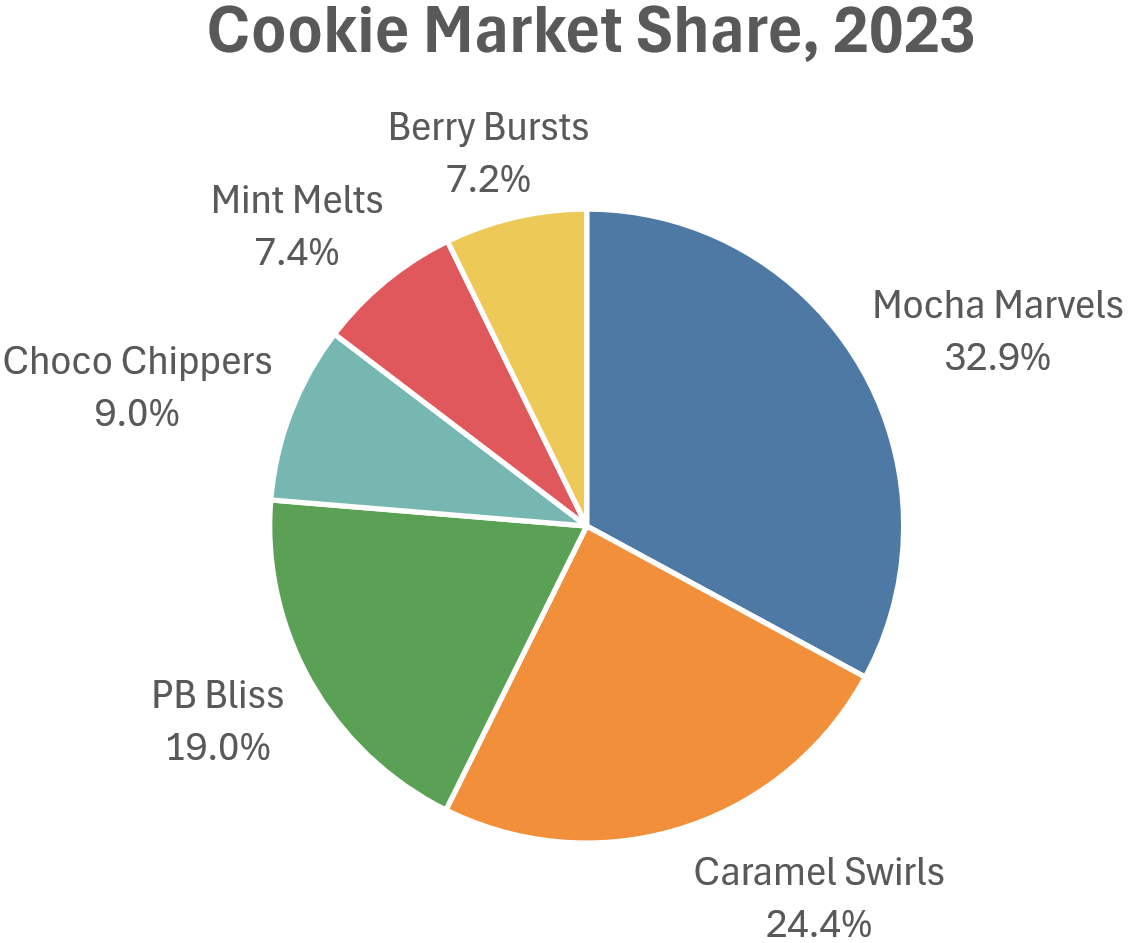
When it comes to the maximum number of parts that should be shown as a pie chart, there are plenty of opinions floating around out there. In this article, I argue that the maximum number of slices depends on the situation and that, in certain situations, even a 30-slice (!) pie chart can be the best choice.
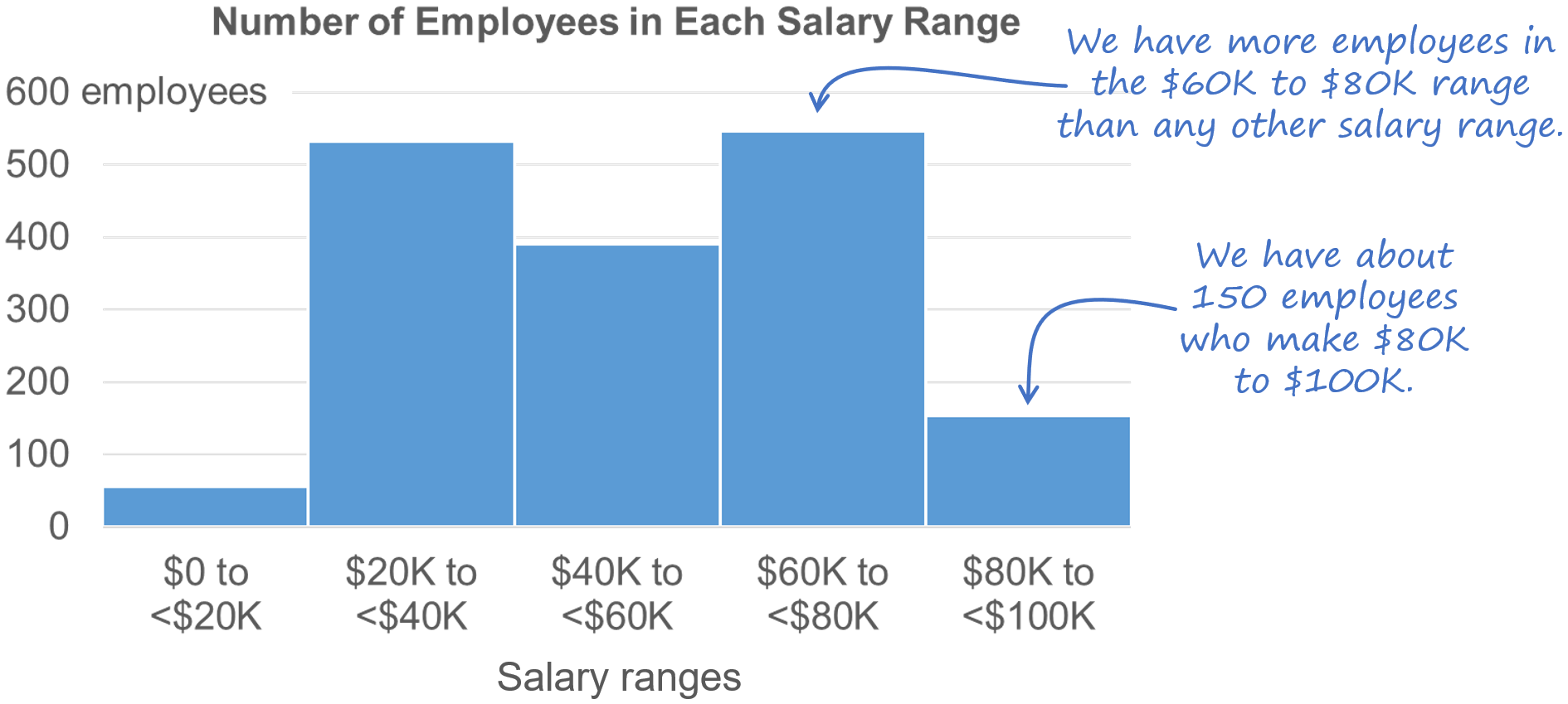
When should you use a bar chart instead of another chart type? Easy question, right?
As it turns out, choosing when to use a bar chart or another chart type is surprisingly complex. In fact, I’d argue that, in a way, bar charts are actually the most complex chart type. Sound strange? Then read this article…
I’ve recently seen a few comments on LinkedIn from people who don’t feel that it *ever* makes sense to use a stacked bar chart to show the breakdown of a single total. While relatively rare, there is a specific situation in which I think it *does* makes sense, though. What is that situation? Find out in my latest article...
Creating “simple” charts is much harder than it sounds. Telling a chart creator to “keep it simple” is like telling a student driver to “avoid traffic accidents.” Well, yes, obviously, but how, exactly, does one do that? While avoiding accidents sounds simple, it requires learning hundreds of rules of the road and days of training and practice.
I’ve been asked a number of times how I went about writing Practical Charts because it’s so, well, practical. This is a wonderful compliment to receive and so, as a cheap thank-you, here’s the story behind the book.
You’ve probably seen “smoothed” or “curvy” line charts like this before. Some people like them and others definitely don’t. In this blog post, I explain when I think it’s okay to use smoothed line charts and when they should be avoided.
You're looking at a chart and it contains a date labeled “10-02-2007.” What day is that, exactly? Feb. 10, 2007? Or October 2, 2007? How about “10-Feb-07”? Is that Feb. 10, 2007, or Feb. 7, 2010? To ensure that your chart readers know what the dates in your chart actually are, choose a date format in which:
The month is alphabetic (e.g., “Aug” instead of “08”)
The year is four digits (e.g., "2011" instead of "11")
As long as the date format that you choose checks both of those boxes, your readers will always interpret the dates in your charts correctly.
When creating charts for “everyday” reports and presentations, it's generally best to stick to chart types that you know are familiar to the audience. Sometimes, though, you can’t use a familiar chart type, either because there aren’t any familiar charts that can accurately represent the type of data to be shown, or because there aren’t any that can communicate the specific insights that you need to communicate about the data.
In these situations, you might have to use a chart type that you know is unfamiliar to the audience. For example, you might have to use a scatterplot or step chart, even though you suspect (or know) that the audience is unfamiliar with that chart type. What to do?
There are three techniques that I use to quickly teach audiences how to read an unfamiliar chart type:
Gentle reveal
Bait-and-switch
Duh insights
What, exactly, are these techniques? Let’s see some examples, starting with…


I don't use radar graphs because more informative and familiar chart types such as heatmaps and overlapping cycles charts can always communicate the same insights.