tl;dr: There are six formatting mistakes that I commonly see in pie charts “in the wild.” This article discusses how to recognize and avoid those formatting mistakes in your own pie charts.
Let’s address the elephant in the room right off the bat: In this article, I’m not going to address the question of whether pie charts are a “good” or “bad” chart type because I’ve published another article on that very topic. If you don’t know what I’m talking about or why anyone would consider pie charts to be “bad,” forget that you ever read this opening paragraph and carry on. Nothing to see here.
Formatting pie charts isn’t terribly tricky but there are some formatting mistakes that I see regularly in pie charts “in the wild.” Of course, what I consider to be a “formatting mistake” is subjective; let me know in the comments if you disagree with any of the ones listed below.
To see these formatting mistakes in action, let’s start with a poorly formatted pie chart and then fix it one step at a time. There are a number of formatting improvements that would make the nasty pie chart below easier to read and more professional looking; just for fun, try to spot as many as you can before moving on to my list of improvements.
Here’s the nasty pie chart:
Spotted all the formatting changes that you’d make? (Yes, I know, a bunch of you are thinking, “Change it to a bar chart.” Ha-ha. Very funny. No, really. Moving right along…)
Here are the formatting improvements that I’d recommend:
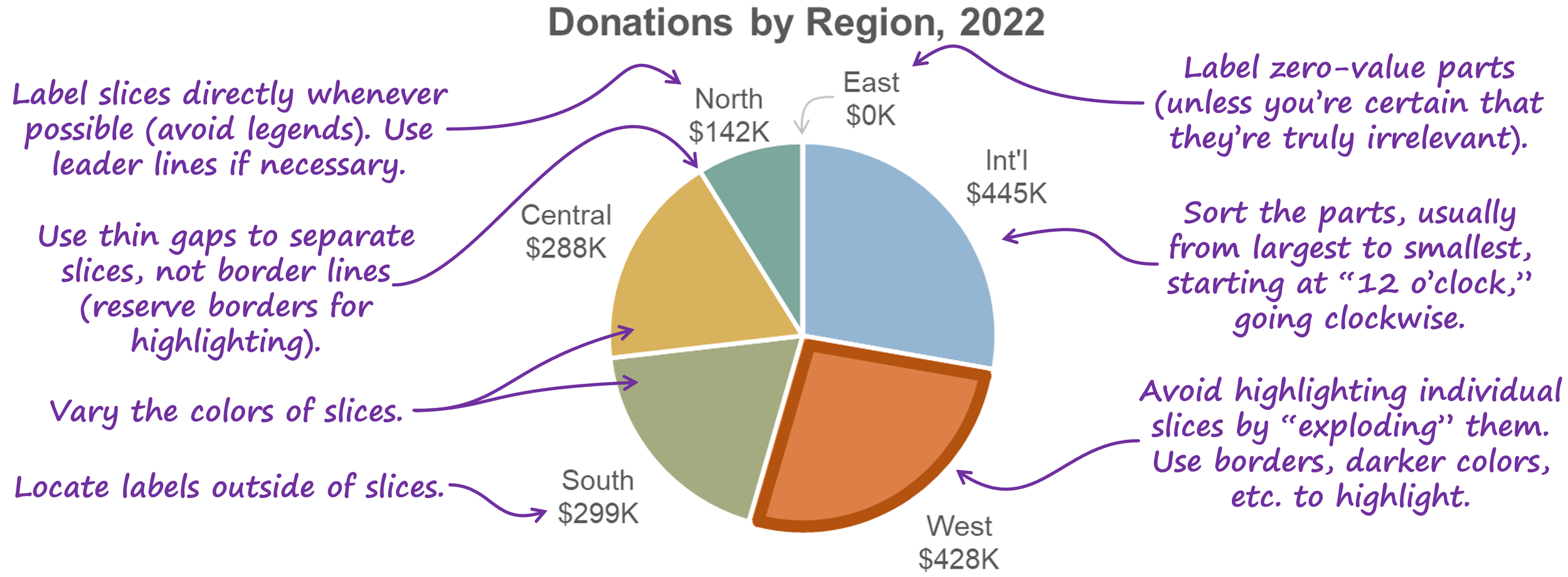
1. Make the slices different colors.
This is usually the first improvement that participants in my training workshops suggest. Technically, however, it’s not necessary because the categories are already distinct from one another, so you don’t need to further distinguish the categories by making them different colors. Having said that, I actually agree that making the slices of a pie chart different colors is an improvement.
Why? I think it has to do with a weird limitation of how human vision works. To see this limitation for yourself, try focusing on the label for the West region in the pie chart above and, without shifting your gaze, try to read the labels for the other slices. Weird, right? Because our vision is surprisingly blurry outside the exact center of our field of view (called the “fovea”), when we look at one slice, the other slices tend to “blur together” into a single, amorphous blob if they’re all the same color.
Making the slices different colors makes them visually distinct enough that they look like separate shapes in our peripheral vision while we’re focusing on one of the slices, so I think it’s warranted.
2. Remove the borders and use thin gaps to separate the slices.
Two benefits:
Reduces visual clutter
Allows borders to be used selectively to visually highlight specific slices (we’ll see an example of that in a moment)
Depending on the software you’re using, you might need to “fake” thin gaps between slices by applying a border to the slices that’s the same color as the background behind the chart (white, in the example above).
3. Move the labels from inside the slices to outside.
Three reasons:
Text labels are easier to read against a plain background than against a busy background of colored pie slices.
There’s more room outside of the slices to show longer pie slice (category) names, if necessary.
We aren’t very good at comparing the sizes of pie slices, and overlaying visually distracting text labels on top of the slices probably doesn’t help.
4. Sort the slices.
Regardless of what type of chart you’re creating, whenever you have non-sequential categories (such as the “region” categories in the pie chart above), it’s usually a good idea to sort them from largest to smallest (or, sometimes, smallest to largest), and this applies to pie charts, as well. In the pie chart above, the audience is probably most interested in the regions with the largest donations, so the regions should be sorted from largest to smallest. In a pie chart, sorting begins at the “12 o’clock” position and then moves clockwise, so the region with the highest donations starts at the 12 o’clock position, and the smaller regions appear after it in a clockwise direction.
5. Do something about “East, $0K.”
In my workshops, participants sometimes suggest removing the “East, $0” label altogether because they assume that the fact that it’s zero means that it’s unimportant. The fact that a value is zero doesn’t automatically mean that it’s unimportant, however. Maybe the East region was expected to have high donations, so the fact that it’s zero could be the single most important piece of information in this chart.
That’s why it's often necessary to visually emphasize very small or “zero-sized” slices, i.e., so that they don’t go unnoticed. “Leader lines” such as the gray arrow in the pie chart above are a good way to do that.
Before summarizing these pie chart formatting guidelines, I want to mention a technique that you’ve probably seen before for visually highlighting slices in a pie chart, called “exploding” pie slices:
I avoid this technique because putting distance between pie slices makes it even harder for audiences to compare the sizes of the slices with the total or with one another. There are perceptually safer options for highlighting slices, such as using a color that’s darker than the rest of the palette or putting a border around slice(s) that you want to highlight:
Wouldn’t it be handy if we were to summarize everything that we saw in this article in a quick-reference “cheat sheet”? I agree:
By the way…
This article is based on a section from my Practical Charts book. Click here to learn more about the book or for purchase details.
If you’re interested in attending my Practical Charts or Practical Dashboards course, here’s a list of my upcoming open-registration workshops.


