
When creating charts for “everyday” reports and presentations, it's generally best to stick to chart types that you know are familiar to the audience. Sometimes, though, you can’t use a familiar chart type, either because there aren’t any familiar charts that can accurately represent the type of data to be shown, or because there aren’t any that can communicate the specific insights that you need to communicate about the data.
In these situations, you might have to use a chart type that you know is unfamiliar to the audience. For example, you might have to use a scatterplot or step chart, even though you suspect (or know) that the audience is unfamiliar with that chart type. What to do?
There are three techniques that I use to quickly teach audiences how to read an unfamiliar chart type:
Gentle reveal
Bait-and-switch
Duh insights
What, exactly, are these techniques? Let’s see some examples, starting with…
The “gentle reveal” trick
Let’s say that you work for a charity that raises donations over the phone from a call center with 32 call center agents. The management team wants to know if agents who’ve had more hours of training also raise more in donations. You determine that a scatterplot would be an effective way to show that relationship, but you’re pretty sure that some members of the management team don’t know how to read a scatterplot. Instead of showing the unfamiliar chart type (i.e., the scatterplot) all at once, consider revealing parts of the chart in steps:

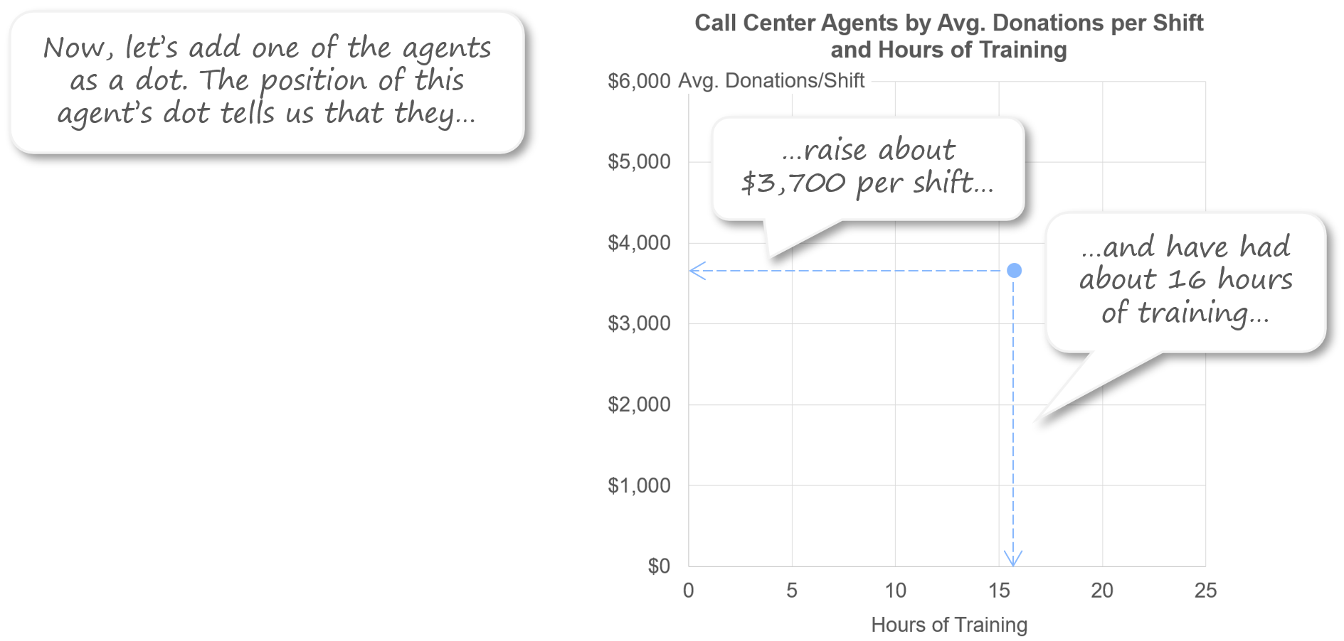
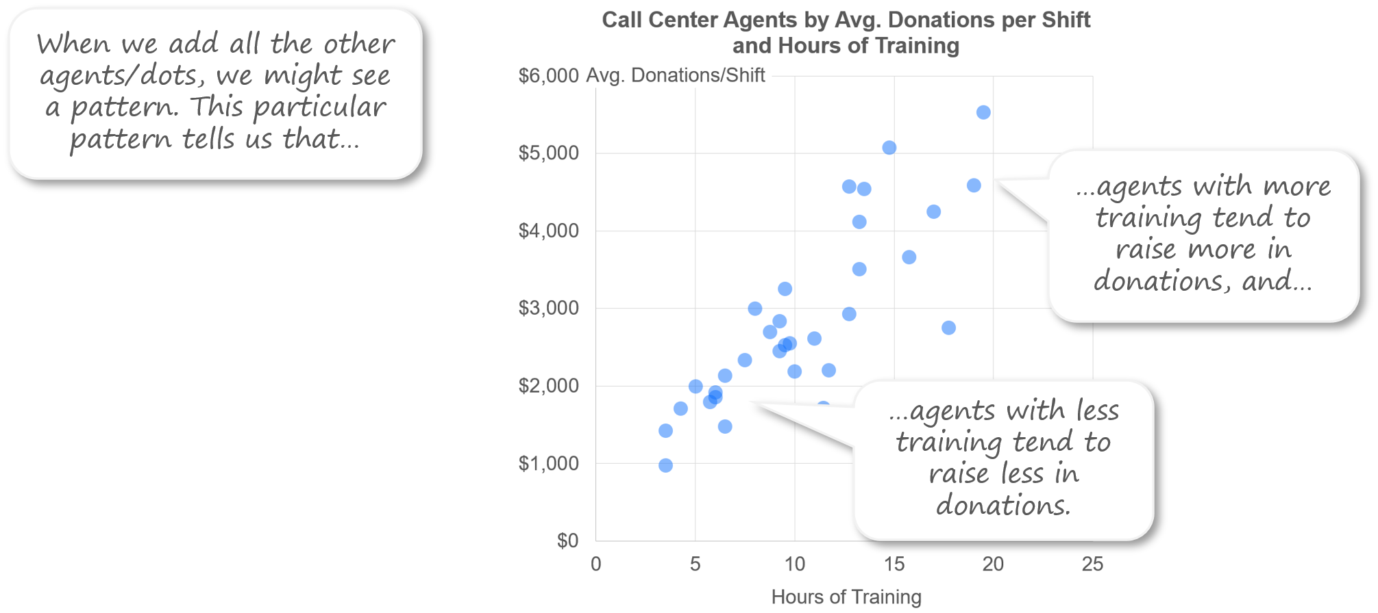
Revealing the chart one part at a time allows the audience to build up an understanding of the chart in steps, which is a lot easier than trying to absorb the whole thing at once.
The “bait and switch” trick
Let’s say that you need to show the price history for a particular model of TV. If you read my recent article on step charts, you know that irregular, persistent time series values like those must be shown as a step chart, not as a standard line chart. What if you suspect (or know) that your audience isn’t familiar with step charts, though? Instead of just showing them this unfamiliar chart type right off the bat, consider starting by showing the data in a familiar chart type (e.g., a standard line chart), and then explaining why the familiar chart type isn’t working well in this situation:
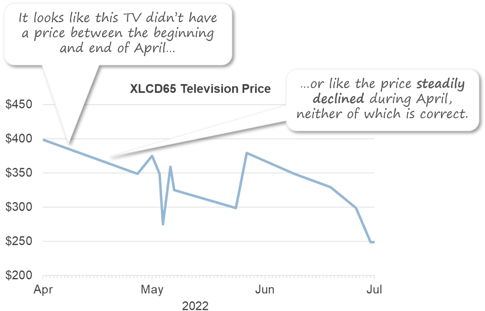
This opens up a “mental space” in the mind of the audience to learn about a new chart type because the one that’s familiar to them isn’t working. Once the audience understands the problems with the familiar chart type in this situation, then show them the unfamiliar one:

This technique also helps the audience understand why it was necessary for you to show them an unfamiliar chart type, so they’re less likely to be annoyed with you, which is a real risk when showing chart types that are unfamiliar to the audience (“Why are you making things unnecessarily complicated?”).
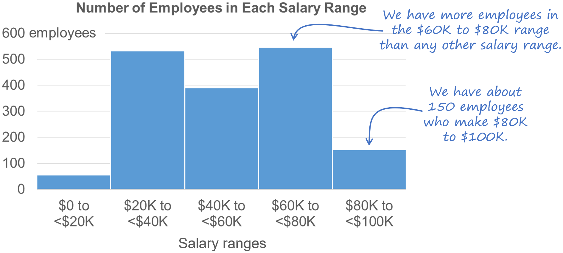
The “duh insights” technique
Let’s say that you need to show how the salaries of employees in your organization are distributed and you determine that a histogram is needed. You’re pretty sure, however, that a histogram is going to fly over the heads of some members of your audience. In that case, you could consider adding a few “duh insights” to your histogram to help the audience figure out how to read it:

“Duh insights” are insights that would be very obvious to anyone who already knows how to read that chart type (hence the “duh”) but that are very helpful to those who aren’t familiar with it and must figure out how to read it on their own. That’s why this technique is particularly useful when the chart is in a document that the audience will be reading on their own, i.e., without you there to explain the unfamiliar chart type to them.
I hope that you find these tips to be as useful as I’ve found them to be. Did I miss any? Are there any other tricks that you use to help audiences to quickly learn how to read new chart types? Let me know in the comments below or on LinkedIn or Twitter.
BTW…
If you’re interested in attending my Practical Charts or Practical Dashboards course, here’s a list of my upcoming open-registration workshops.